Choosing the right paint colors for your home can be both exciting and daunting. Colors have a profound impact on our emotions and perceptions, influencing everything from our mood to how spacious a room feels. Understanding the science of color can help you make informed decisions that enhance the aesthetic appeal and functionality of your space. The A Team explores the principles of color selection and offers practical advice on choosing the perfect paint tones for every room in your home.
Understanding Color Psychology
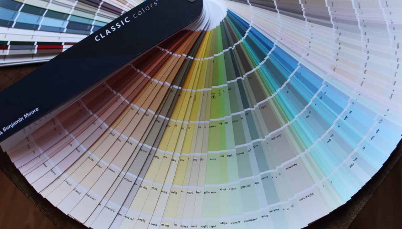
Color psychology is the study of how colors affect human behavior and feelings. Different colors can evoke various emotional responses, making it important to consider the desired atmosphere for each room when selecting paint colors.
Warm Colors
Warm colors, such as reds, oranges, and yellows, are energizing and inviting. They can make a room feel cozy and intimate but may also seem overwhelming if used excessively. These colors are ideal for spaces where social interaction and activity are encouraged, such as living rooms, dining rooms, and kitchens.
Cool Colors
Cool colors, including blues, greens, and purples, have a calming and soothing effect. They are often used to create a sense of tranquility and relaxation, making them perfect for bedrooms, bathrooms, and other spaces where a peaceful ambiance is desired. Cool colors can also make small rooms appear larger and more open.
Neutral Colors
Neutral colors, like whites, grays, and beiges, are versatile and timeless. They serve as a subtle backdrop that can complement a wide range of furnishings and decor styles. Neutrals are ideal for creating a clean, modern look and can be used throughout the home, providing a cohesive and balanced aesthetic.
The Impact of Natural and Artificial Light
Lighting plays a crucial role in how colors are perceived. The type and amount of light in a room can change the appearance of paint colors, influencing everything from their brightness to their undertones.
Natural Light
Natural light varies depending on the time of day, the direction the room faces, and the presence of outdoor elements like trees or buildings. For example, north-facing rooms often receive cooler, bluish light, which can make colors appear more muted. In contrast, south-facing rooms receive warm, yellowish light that can intensify colors. Understanding the natural light in each room can help you choose colors that look appealing throughout the day.
Artificial Light
The type of artificial lighting in a room also affects color perception. Incandescent bulbs emit a warm, yellow light that enhances warm colors but can dull cooler tones. Fluorescent lighting typically has a cooler, blueish hue that can make warm colors appear washed out. LED lights are available in a range of color temperatures, allowing more flexibility in achieving the desired ambiance. When selecting paint colors, consider how they will look under the room's primary light sources.
Choosing Colors for Specific Rooms
Each room in your home serves a different purpose, and the colors you choose should reflect the function and desired mood of the space. Here are some tips for selecting paint tones for various rooms.
Living Room
The living room is often the central gathering space in a home, where family and friends come together. Warm, inviting colors like soft yellows, warm grays, or muted reds can create a cozy atmosphere. If you prefer a more contemporary look, consider neutral tones with bold accent colors in decor or artwork.
Kitchen
Kitchens benefit from colors that are both energizing and welcoming. Warm hues like sunny yellows or earthy oranges can stimulate appetite and conversation. If your kitchen receives plenty of natural light, cooler shades like light blues or greens can provide a fresh, clean feel. White or off-white tones are also popular in kitchens, offering a bright and airy ambiance.
Bedroom
Bedrooms should be a sanctuary for rest and relaxation. Cool colors like soft blues, gentle greens, or lavender can create a calming environment conducive to sleep. Neutrals are also a good choice, providing a serene backdrop that can be easily updated with bedding and accessories.
Bathroom
In bathrooms, clean and fresh colors are often preferred. Light blues, soft greens, or crisp whites can make the space feel larger and more spa-like. For a bolder look, consider deep navy or charcoal, balanced with white fixtures and bright lighting.
Home Office
Home offices should promote focus and productivity. Neutral tones like soft grays or beiges can create a professional and calming environment. If you prefer a bit of color, consider muted shades of blue or green, which are known to reduce stress and enhance concentration.
Creating a Cohesive Color Scheme
A cohesive color scheme ensures that different rooms in your home flow together harmoniously. This doesn't mean that every room needs to be painted the same color, but rather that there should be a sense of continuity throughout the space.
The 60-30-10 Rule
The 60-30-10 rule is a classic design principle for creating balanced color schemes. It suggests that 60% of the room should be a dominant color, 30% a secondary color, and 10% an accent color. This approach can be applied throughout the home, using a consistent color palette to tie different rooms together while allowing for individual variations.
Accent Walls and Features
Accent walls are an effective way to introduce bold colors or patterns without overwhelming the space. Choosing one wall to highlight with a different color or texture can add depth and interest to a room. This technique is particularly useful in open-concept spaces, where it can help define different areas.
Testing Colors Before Commitment
Before committing to a paint color, it's wise to test it in the space. Colors can look different in large areas compared to small swatches, and lighting can change their appearance throughout the day.
Sample Paints
Many paint manufacturers offer small sample sizes that allow you to apply a patch of color on the wall. Observing the color at different times of day and under various lighting conditions can help you determine if it suits the space. Alternatively, you can paint a large piece of poster board and move it around the room to see how the color interacts with different elements.
Contact The A Team for Expert Real Estate Guidance
Choosing the right paint colors can transform your home, creating a space that reflects your personality and meets your functional needs. Whether you're preparing to sell or simply refreshing your space, understanding the science of color selection is key to achieving a beautiful and cohesive design. For those looking to buy or sell homes in Lake Havasu, The A Team offers expert guidance and local market knowledge. Contact The A Team to learn more about available properties and receive personalized support throughout your homeownership journey. Reach out today to explore the possibilities and find your dream home in Lake Havasu.